Tips for Choosing the Right Wedding Colour Palette for you!
Finding Inspiration
Main sources of inspiration usually come from social media posts. However, some may be inspired by a season or creative theme where a palette is obvious. Do you already have any colours in mind? List the colours you would like to display in your decor elements. Take screenshots of themes you gravitate to. Store these for your future meetings with the Creative Director at Diya Decor.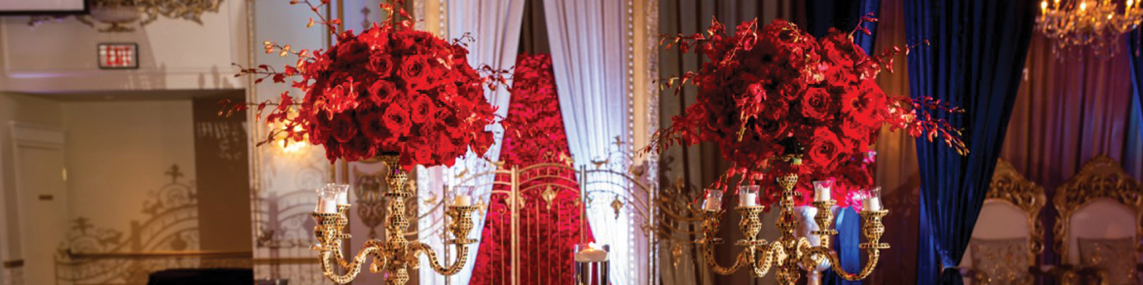
Consider the Venue(s) and Season
When choosing a palette for your wedding, keep in mind the colors already in place at the site where the ceremony or reception will be held, and build around them. Using one or two colors with a neutral such as white, taupe, champagnes is nearly always effective. If you pick three or four colors, consider using one or two of them sparingly; intense hues make particularly striking accents. Combining more than four color families, however, can look haphazard. ? Take into consideration any windows in the venue. Is there light coming in? Do we see an abundance of trees or natures elements. These all play to the overall colour palette.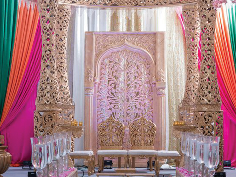
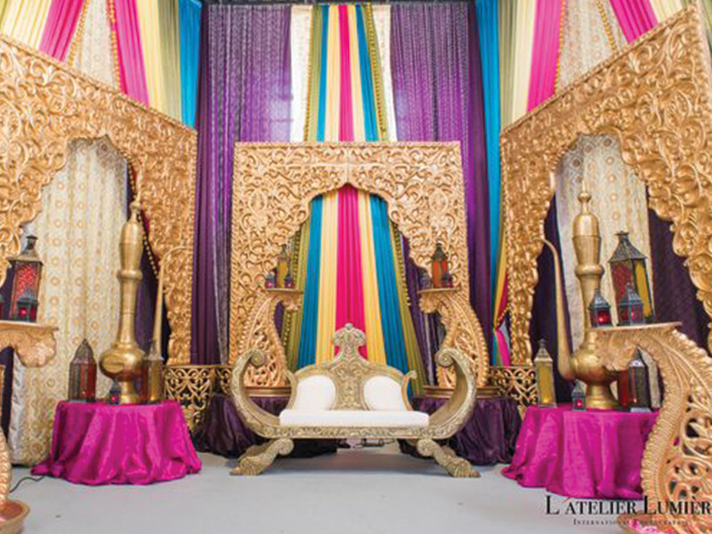
A Play-It-Safe Palette is Homogenous
The simplest way to go chic? Go for an ombré effect—in this case, showcasing pink from the lightest pastel to the darkest magenta. Picking one colour and applying it in variying shades is always appealing to the eyes and comes out looking elegant.
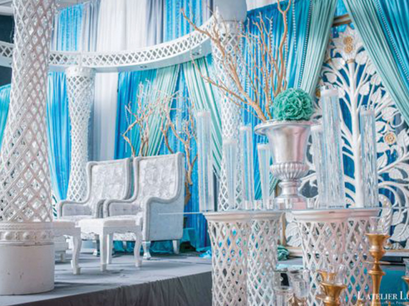
Picking Out Focal Settings in your Venue
The venue space can be quite overwhelming. It is easy to apply colour everywhere filling the space with an abundance of colour. This can go very right or very wrong depending on your colour palette and the colours you choose to bounce around your space. Sit in your design consult meeting and be sure of your focal points. Is it your backdrop? Is it on your trousseau, will splashes of colour be in the reception lobby or mainly on the tables? Make notes of where as bride and groom you would like to emphasize colour and where you could see holding some back.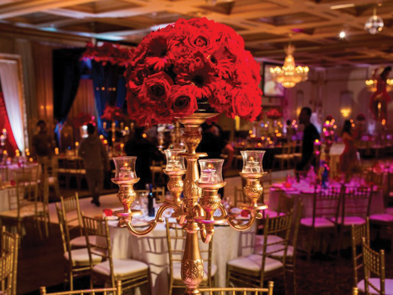
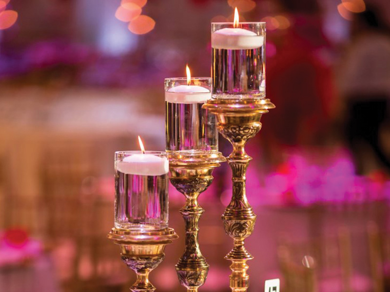
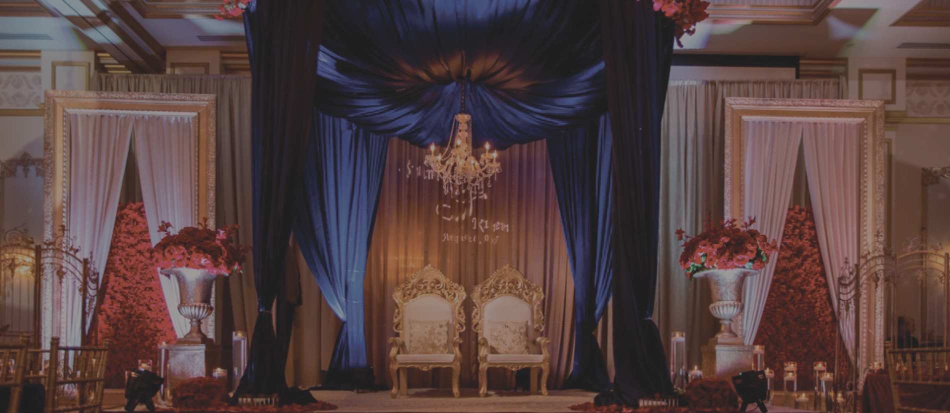
Creating Your Ambience
Lighting plays a very integral part of creating the ambience; look and feel of your event decor. Is it an evening filled with mystery and dimmed lighting? Will your event have a bright and morning feel? Chandeliers in the venue or natural light can alter colours to look brighter; brightening a yellow. With the lights off that same yellow can look like a mustard or gold. Mindfully managing the ambience that you wish to create will also help in choosing the right colour palette for your vision.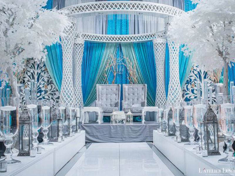
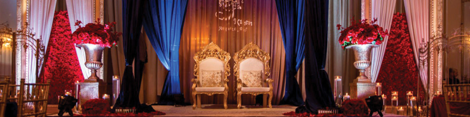
Amping Up The Glam!
Go full-on glam by pairing your hue with a metallic. Gold, copper, or silver accents set the scene for a formal, festive affair.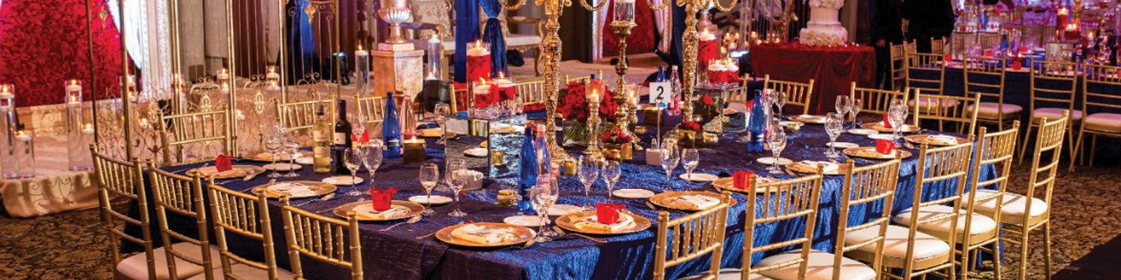
Personal Style
At Diya Decor we always encourage our bride and grooms to take the opportunity to showcase who they are. It’s YOUR special day…tell your story! And let’s be honest, everyone’s love story is unique and beautiful. Weddings tend to all follow a similar process, but sprinkling the wedding with a little more you, goes a long way. Are you a classic couple? Is your wardrobe drenched in navy’s, greys, blacks, and whites? Maybe you two carry a finesse while wearing bold colours like red and baby blue. Personalities can dictate the elements of whether your colour palette will be one of sophistication or dramatic flair. You decide!